Looks like Java, not Cocoa.
Deprecated: trim(): Passing null to parameter #1 ($string) of type string is deprecated in /home/public/kirby/toolkit/lib/str.php on line 506
Deprecated: trim(): Passing null to parameter #1 ($string) of type string is deprecated in /home/public/kirby/toolkit/lib/str.php on line 506
Deprecated: trim(): Passing null to parameter #1 ($string) of type string is deprecated in /home/public/kirby/toolkit/lib/str.php on line 506
Deprecated: trim(): Passing null to parameter #1 ($string) of type string is deprecated in /home/public/kirby/toolkit/lib/str.php on line 506
Deprecated: trim(): Passing null to parameter #1 ($string) of type string is deprecated in /home/public/kirby/toolkit/lib/str.php on line 506
Deprecated: trim(): Passing null to parameter #1 ($string) of type string is deprecated in /home/public/kirby/toolkit/lib/str.php on line 506
Deprecated: trim(): Passing null to parameter #1 ($string) of type string is deprecated in /home/public/kirby/toolkit/lib/str.php on line 506
Before september 2011, I was a Windows user, I didn't have this urge to learn and acquire applications, actually, my PC was close to a blank sheet. After my move to the Mac, I soon developed some sort of addiction for applications which made me eager to learn more and culminated with the pleasure to write for AppStorm.
But why? Why I only joined the #teamappdiction when I got into OS X? Of course, we could digress about functionalities and go into a app-specific basis, however there's a crutial difference that explains the whole dilemma: Look & Feel.
I often pay a few extra bucks for an application that looks good because within a routine like mine, my applications are my clothes. I wear them and they must make me feel cozy and great, beautiful and joyful. Windows apps, from my experience (which is not that great), are like customes, meanwhile Mac Apps range from tuxedos to white t-shirt with blue denim. One is the goofy and the other matches with your day-to-day.
Please, don't rampage over me because of a personal statement, there are probably great looking applications for Windows that I didn't get hold of.
Still, on a OS X environment there are a few applications that just don't look like they belong to the Mac. They seem like splatters wrapped on a great looking paper. They don't feel comfortable and I'd like to share my theory about them:
Everything goes down to the toolbar.
Often, when an application has a thin toolbar compressing solely the default buttons at the left (close, minimize and maximize), it usually looks like crap, in my opinion, or worst, it looks like Java, it's like one of those poor excuses to advertise it as cross-platform, simply grab the Windows app and deliver it on a wineskin package for OS X.
Two recent applications on Mac App Store got some buzz and join this criticized group: BlueNote and Horus News Dealer. Focus on their toolbars.

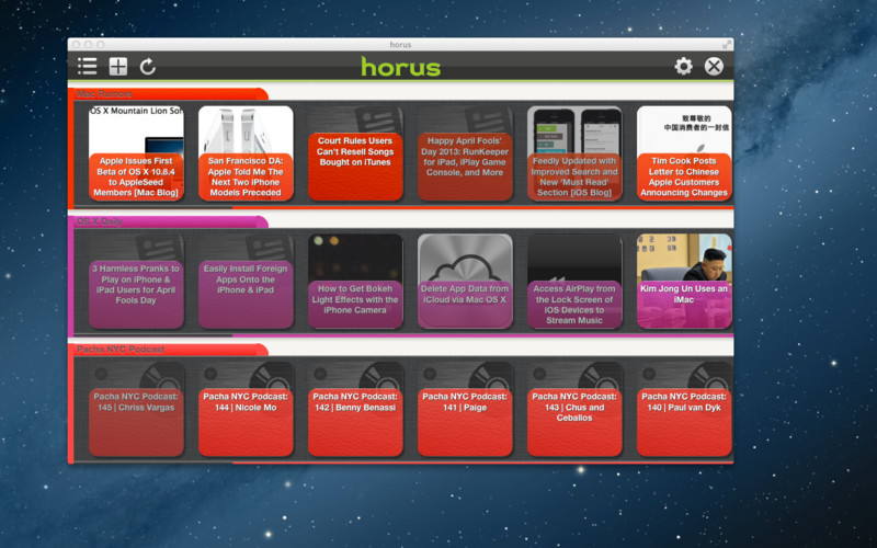
Obviously, sometimes it is not only about this detail, I think the whole color palette of these applications is done wrong, specially on the RSS reader, but it is the toolbar that ties them both together. If you believe this is only a coincidence, think a little bit further for a moment.
I want you to imagine a pop-up right now, doesn't it look just like that? Thin toolbar, colorful content and no concern with depth? Would you purchase something that looks like one of the major plagues on the web?
Then, of course, there are Fluid apps, which display web apps similarly, however, Fluid's fruits aren't supposed to be Mac applications, but a better way to handle your web applications from desktop.
Successful examples
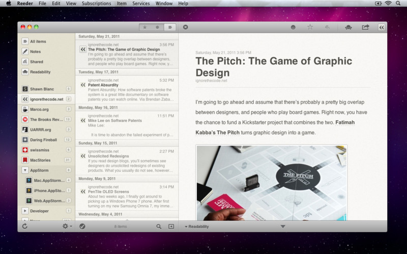
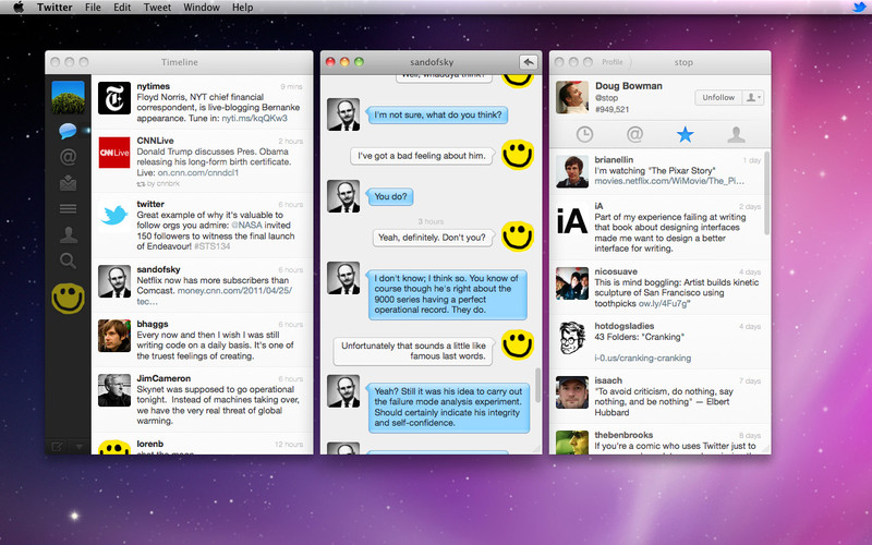
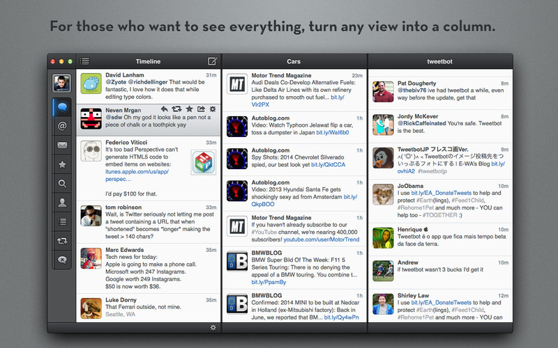
How to fix this? Well, when it comes to the toolbar itself, making it a bit taller seems to solve everything, but most important is to make it look as part of the application instead of a distant element, both criticized examples don't blend with their toolbars and it looks like an excess on the screen.
See some great examples in Sparrow, Reeder, Twitter for Mac and Tweetbot:

Is this a rule of thumb?
Not at all, maybe I can state that "if the design sucks, it has a thin toolbar", but the opposite is not always true, as proven by applications like LittleSnapper, Courier (both my Realmac Software), DaisyDisk, The Hit List, Things, ad infinitum.

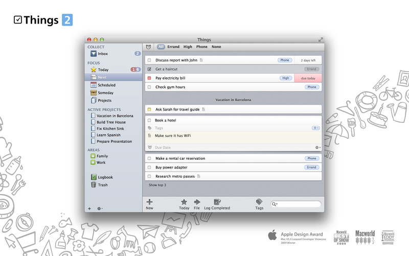
Also notice how these listed applications often transfer the toolbar to the bottom, at least its tools. Yet the truth is that the real problem is when an application lacks in depth and integrity, often it begins with the size of the toolbar.
PS: Even flat design has some sort of depth on its layers to label important elements, it is about saving the sparkles for when you really need them, as the red buttons from Gmail. I can even compare this to the film director John Ford, who used to save camera movements and work with a static frame for whenever he would use the movements they'd have a bigger impact.